 |
| 1959 |
 |
| 1937 |
 |
| 1899 |
 |
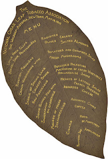
| 1912 |
By CHIP KIDD
The worlds of graphology and gastronomy go together like surf and turf in "Menu Design in America: A Visual and Culinary History of Graphic Styles and Design 1850-1985" (Taschen, $60), by Steven Heller and culinary historian John Mariani.
Chronicling the golden age of the American menu—in restaurants, nightclubs, diners, coffee shops, bars, train cars, steamships, airport VIP clubs, first-class cabins, drive-throughs, family faves and hotel lounges (room service listings included)—the 392-page hardcover tome traverses the early roots and dazzling evolution of America's aesthetically-rendered "bills of fare." (click below to read more)
The saga of these deceptively alluring food-and-cocktails playbills begins with the advent of the menu as marketing tool (much like matchbooks), then to its usage as a keepsake status symbol (bragger's rights to have dined, drank or stayed at ritzy spots such as Jack & Charlie's "21" Club and vintage Four Seasons), and onward to its novelty as a collectible and appreciation as outright art (particularly deco and nouveau, followed by tiki bar-crafty, jet-set streamlined and starburst-y 'tini-time ingenuity).
From Las Vegas's Flamingo Hotel to Manhattan's Stork Club—with a generous side of menus shaped like crabs (Frederick & Nelson), burgers (Melrod's), toads (Toed Inn), cowboys (The Stirrup Room), turkeys (Hotel Leighton), drums (La Conga) and hogs (Pig Stand)—the establishments represented in these pages add up to nothing short of a time capsule.
Many of the menu graphics, particularly those from the 1930s and '50s (Piccaninny Bar-B-Q), also embody American bigotry, from those depicting naked orgy-ists (Cotton Club) to Aunt Jemimas (Old Dixie Southern Barbecue) to Al Jolson-styled blackface figures (often on menus at the most elitist of clubs). One circa-1935 Seattle restaurant chain, unfortunately named Coon-Chicken Inn, features a menu shaped like the head of a winking African-American waiter in bellhop cap. Mexicans and Asians are equally caricatured with racial stereotyping. Full disclosure: For four of the past 10 years, I have been a judge of restaurant graphics for the James Beard Foundation's annual design awards. This book left me wondering, What on earth happened to menu graphics?
The examples here, more than 800 of them, are jaw-dropping—particularly those out of "cafe society" New York and Los Angeles dining halls and clubs—the extravagance of the printing, the meticulous illustrations, the quality of the production, the distinct typefaces, the heavy print stocks, the pop-outs and fold-outs, from minimalist chic to maniacally cluttered.
Great printing was pretty cheap at the turn of the 20th century and onward through the '60s. Today, cheap printing is…cheap. Anyone can crank out a menu on their laptop, or at Kinko's, regardless if they know (or care) about distinct design. From what I've seen, most do not.
Luxuriating vicariously in the pleasures of this book—edited by cultural anthropologist Jim Heimann and featuring a meticulously researched, must-read preface and introduction—you can't help but become hungry…for the food of course, but also for something more: the bygone days of our country's splendidly rich and complex graphic past.
Epicureans of both good food and artful design will do well to make it their coffee table's main course.
—Mr. Kidd is a recipient of the Cooper-Hewitt National Design Award for Communications Design, and has created more than 1,200 book jackets.

No comments:
Post a Comment